The Basics of NJSHAD
Through doing NJSHAD demonstrations, we've found that some users need additional assistance so they can get started using NJSHAD. Aspects of the system that we take for granted as "easy" actually aren't to users who are not experienced with online data query systems. This page covers many NJSHAD basics. If you think of other things we should add here, please let us know. Our users are valued stakeholders who can help improve NJSHAD to be more accessible and useful to them.
Site Navigation
Symbols
Who's responsible?
Graph It!
Rearranging Columns
Hover Over
Sorting, Hiding, and Filtering Table Columns
There are two types on menus in NJSHAD:


- The top navigation menu is the same on every NJSHAD page, so you should always be able to find your way back home.

- The left navigation menu is "context specific" and changes depending on which section you're in and/or which page you're on.
Pluses and Minuses
Throughout NJSHAD you will see PLUS signs and MINUS signs.


In menu buttons, they look like this (and the minus will be an X):


Clicking a PLUS sign will expand content below it.
Clicking a MINUS sign will collapse the content below it.
Question Marks
In the Dataset Query section of NJSHAD, you'll see question marks.


Hover over the blue ones and you'll get a pop-up with more information.
Click the yellow ones to go to another page with a lot more information.
Throughout NJSHAD you will see PLUS signs and MINUS signs.
In menu buttons, they look like this (and the minus will be an X):
Clicking a PLUS sign will expand content below it.
Clicking a MINUS sign will collapse the content below it.
Question Marks
In the Dataset Query section of NJSHAD, you'll see question marks.
Hover over the blue ones and you'll get a pop-up with more information.
Click the yellow ones to go to another page with a lot more information.
At the bottom of each page, below a solid gray line and above the dark grey box full of light blue links, you'll see bold black text with a program name, address, URL, e-mail address, and possibly other contact info.

That is the program in NJDOH that's responsible for the information on that page. They may not necessarily have put the info into NJSHAD, but they are the original source of the data or information.
If you have questions about the information on a page (other than website-related issues), that's who you should contact for more information.
After you submit a query, Graph It! will appear in the left navigation menu.

Click this button to create or change a graph of the data in your query result. Change graph types as many times as you like to get the graph you need.
Click this button to create or change a graph of the data in your query result. Change graph types as many times as you like to get the graph you need.
All NJSHAD table columns can be moved from left to right to rearrange the order in which they are displayed.
Click the column header, drag the column to where you want it, and let go.
Click the column header, drag the column to where you want it, and let go.
Throughout NJSHAD, you can hover your mouse over certain text to see a pop-up with more information about where that link will take you or get more information about an image.
Hover Over
In NJSHAD graphs and maps, if you hover your mouse pointer over a data point, the corresponding data (rate, numerator, denominator, etc.) will pop-up.
Removing Graph Categories
Let's say you have a graph for four causes of death over the years 2010 to 2015 and you decide you only want to see three of the causes. Go to the legend/key to the right of the graph and click the cause you no longer want to see and it'll disappear from the graph!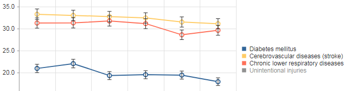 Click it again and it'll come back.
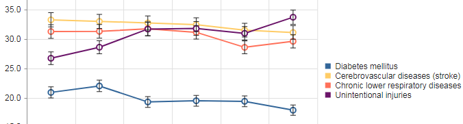
This works for any category, not just causes of death.
Fun With Maps

 ← In the top left corner of each map are tools to zoom in (+) and zoom out (-).
● 4 arrows: zoom way out.
● Rounded arrow: reset map to original size.
→ In the top right corner of each map is a control panel.
In NJSHAD graphs and maps, if you hover your mouse pointer over a data point, the corresponding data (rate, numerator, denominator, etc.) will pop-up.
Removing Graph Categories
Let's say you have a graph for four causes of death over the years 2010 to 2015 and you decide you only want to see three of the causes. Go to the legend/key to the right of the graph and click the cause you no longer want to see and it'll disappear from the graph!
Click it again and it'll come back. This works for any category, not just causes of death.
Fun With Maps
← In the top left corner of each map are tools to zoom in (+) and zoom out (-).● 4 arrows: zoom way out.
● Rounded arrow: reset map to original size.
→ In the top right corner of each map is a control panel.
- Click the X to shrink the panel.
- Click None under Base Map to remove the terrain layer.
- Change the Grouping Type and Size farther down in the panel.
- Reverse the colors at the bottom.
All NJSHAD tables have little arrows in the column headers that look like the letter V.  These arrows can be used to sort and hide columns and to filter rows.
Clicking on the arrow will bring up this menu: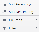 .
.
The first two choices, obviously, sort the table by the data in that column: low value to high value or vice versa.
Clicking or hovering over Columns will show a list of the column names with checkboxes.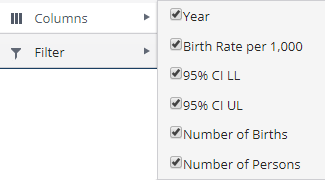
Unchecking a box will hide that column from the table. Checking the box will bring it back.
Clicking or hovering over Filter will show a selection box that lets you only show rows that contain certain values.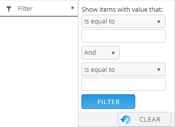
These arrows can be used to sort and hide columns and to filter rows.Clicking on the arrow will bring up this menu:
.The first two choices, obviously, sort the table by the data in that column: low value to high value or vice versa.
Clicking or hovering over Columns will show a list of the column names with checkboxes.
Unchecking a box will hide that column from the table. Checking the box will bring it back.
Clicking or hovering over Filter will show a selection box that lets you only show rows that contain certain values.
